Thank God It's already Friday ! Time to change of promo game !
First, let's sum up our releases of the week :- Kama Oxi / Pink & Dicker
- Lily Rainheart / Get Your Pulse Racing
- Lisa Belys / Nighttime Lover
- Shania / Soft To The Touch
- Bella Angel / Guilty Pleasure
- Elza / La Fin De L'Innocence
- Samantha Cruuz / Vanille Citron
And on mobile :
- Kama Oxi & Eve Sweet - Sexy Mates
- Emiri Momota - Picture This
- Elza - Elza's desire
And in VR 180 :The delicious Samantha Cruuz :
https://www.istripper.com/vr180/detail/c27c2bc90d05b144
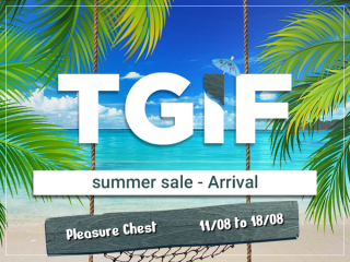
SUMMER SALE - ArrivalTHE PLEASURE CHEST is here from August 11 to 18 !
Click on the arrow in front of each line to reveal the line' symbols.
You can win up to 200 credits if you align 3 identical symbols on a line.
As you play, you will also randomly collect treasure keys. Treasure keys are saved during all the event's duration.
As soon as you get a third key, you can open the chest and get 20, 200, 1000 credits or a gift card, a joker card or a special event card.
And remember, your progression bar makes you win the
Special Event Card of the sublime Carla Vyxx then gift cards once you have reached her.
Enjoy!